Westfield Rebranding

Role: Lead Designer : responsible for brand and end-to-end design of retail, parking, and gift card user experiences.
A visit to Westfield is never about just one store, it's a layered experience shaped by many brand touchpoints: apps, mobile, kiosks, directories, social media, and the website.
The new Westfield.com.au was designed to reflect this, inspiring users through curated layers of brand stories, local flavour, exclusive offers, and editorial content.
We were tasked with delivering a "digital reset product" for Westfield. Collaborating with Fjord Agency, we set the strategic and design foundation for Westfield’s future digital and brand ecosystem.


Big Ideas, Real Impact.
Client: Westfield / Scentre Group
Collaborators: Fjord, In-house Product Design, Content, and Engineering Teams
Project Scope: 40 Websites | 1,500+ SmartScreens | SuperScreens | Mobile App | Email | Digital Directories | 55 Kiosks | Ticketless Parking Machines
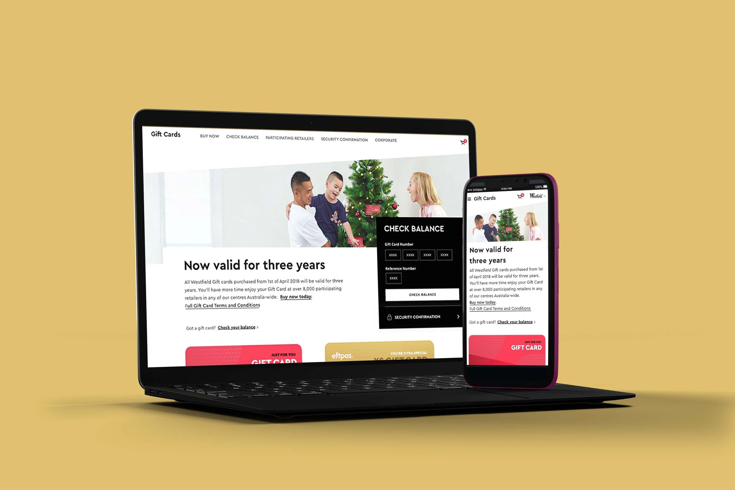
Westfield set out to unify its digital and physical experience across all touchpoints, reflecting new brand values: Vibrant, Human, Curated, and Easy. Working closely with Fjord and cross-functional teams, we redesigned the digital ecosystem to create a consistent, elegant, and user-friendly brand experience.
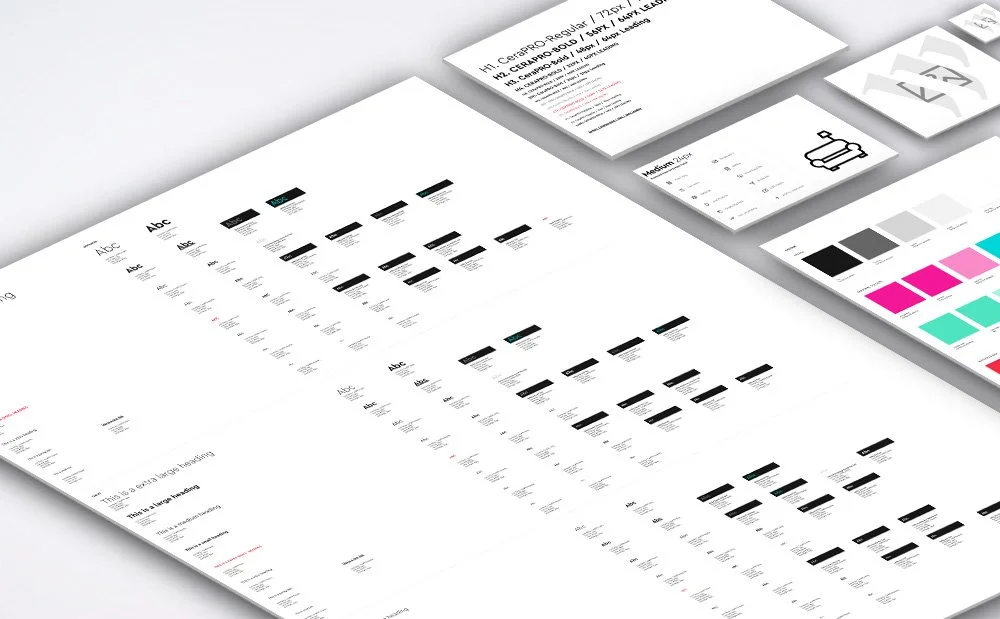
A refreshed visual identity supported this transformation. While the iconic Westfield logo remained, we introduced a dynamic “W” graphic symbolising the connection between online and in-centre experiences. This was complemented by an expanded colour palette, bespoke patterns, modern typography, and a more conversational tone of voice, brought together within a unified Design System to ensure consistency at scale.
The transformation began with a “Digital Reset”, a foundational website that restructured information architecture, streamlined key user journeys, and applied the new visual language. Features were also introduced to respond to a user’s time and location, creating a more contextual experience.

In the second phase, the focus shifted to building a connected ecosystem that linked digital and physical channels while delivering more value to both customers and retailers. Ongoing user research and on-site testing helped identify pain points and informed iterative design improvements.
Within a cross-functional squad model, I led the redesign of three key experiences:
Gift Card Journey – simplifying purchase, gifting, and redemption
Retailer Experience – tools to better support Westfield’s retail partners
Parking Experience – improving ticketless parking navigation and payments
I worked closely across product, design, content, and engineering, contributing to the Brand Design System Library, visual identity, and style guides while leading the end-to-end design of several product experiences.
The result was a cohesive, scalable digital ecosystem that unified Westfield’s online and in-centre experience while creating a strong foundation for future innovation.
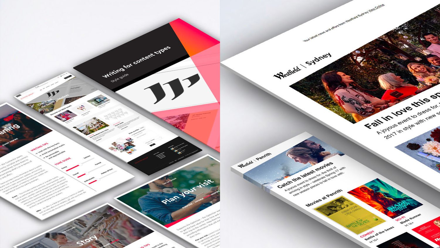
Brand guidelines

UI Library

UI Library

Brand visual Identity